Introduction
This was an example project I was asked to do as part of an interview in 2022. I was told to do my best with the knowledge I had and was given a week to produce the deliverables outside of my normal work. This doesn’t illustrate my collaboration process with a production team, reasearchers, and other designers (which I love to do), but it does show my personal process for thinking through a product design.
Requirements
Here is a copy of the project request I was given:
Design Challenge
Many seniors face loneliness and social isolation especially after their companions pass away. There are also millions of dogs each year that are euthanized because they could not find a home for them.Barklify has decided to partner with AARP and ASPCA to establish a service that connects seniors who are seeking to adopt dogs. You have been tasked by Barklify (largest dog adoption organization) to design a platform that matches seniors with dogs. Keep in mind that seniors are not the most tech savvy, so affordances that are familiar to younger tech savvy folks are not intuitive to them. Your goal is to help seniors find their ideal companion based on some commonly understood factors: breed, gender, age, temperament etc. You can be creative and come up with your own as well.
Deliverables
The following are the deliverables we expect from you.
- Mobile first designs: Seniors all have smartphones and only a few have computers so make your designs mobile first.
- Provide high level flow to the app and some wireframes.
- Flesh out high fidelity designs for a couple of screens.
- Give us a glimpse of your process, etc. How you approached the problem, any research you did, why you made certain decisions, rough mock ups etc.
First Thoughts
Initially, I have a few potential solutions come to mind:
- A traditional list-style database where users can apply filters to narrow down the options they’re browsing through. Much like Amazon, or other ecommerce sites.
- A matchmaking format, where the app asks the user for some preferences, then provides the user with potential matches to browse through. The browsing could be one-at-a-time like Tinder, where the user approves or deneys the potential matches.
- A non-browsing experience, where the user fills out some information on their preferences, and then receives suggested matches. The suggested matches could even come through text, email, or phone calls so the user never has to take initiative to go to the site on their own again.
I tend to lean toward the last option right now, since it focuses more on solving the user’s problem than just on creating software to be used. Of course, a single app could include all of the features listed above, but for a simple user experience it would be best to emphasize one as the default.
Next, I’m going to do some research on existing solutions to see if I can find anything that could be borrowed or innovated.
Research
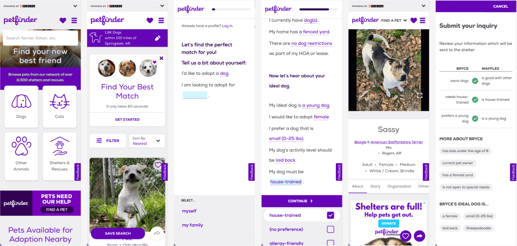
Petfinder
This seems to be the best example I can find. The site is pretty mobile friendly, contains all the search/filter fuctionality of the others, and has a nice questionnaire that’s conversational and saves your pet preferences to your profile. The answers to the questions didn’t persist through account creation (you have to have an account to save your preferences), but that’s more of a technical bug than a design issue.
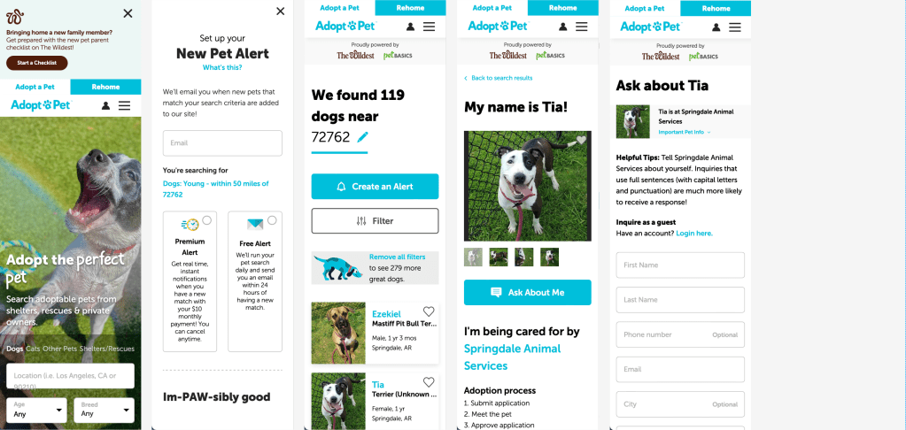
Adopt a Pet
Another good example. I’d say slightly better UI, but no questionnaire to save pet preferences. This one does emphisize reciving notifications that fit your search results. Though I don’t have a good feeling about having a premium subscription model for instant pet alerts. Maybe it makes sense if it’s important to act quickly when your ideal pet is listed. However, my impression is that it may prey upon someone with a heart of gold who is filling up their house with adopted animals and draining their bank account for constant updates on animals in need.
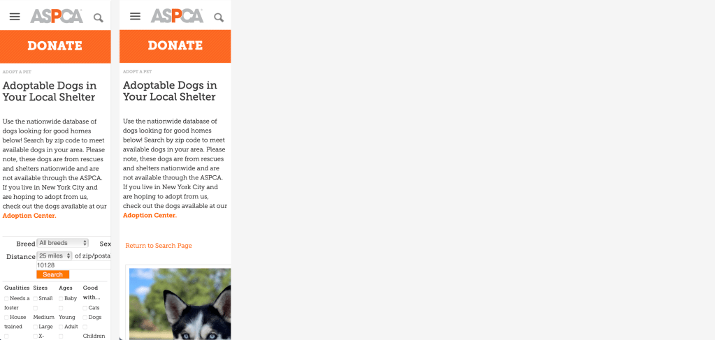
ASPCA
Not a mobile-friendly site. It also doesn’t seem to have a clear user-flow. I didn’t know what ASPCA was when I got to the site, I just wanted to think about adopting a dog. My impression was that these people do a lot of things that I didn’t really care about at the time (because they weren’t about getting me a dog as easily as possible). They probably do great things, but they should consider designing their sight from the perspective of mulitple personas.
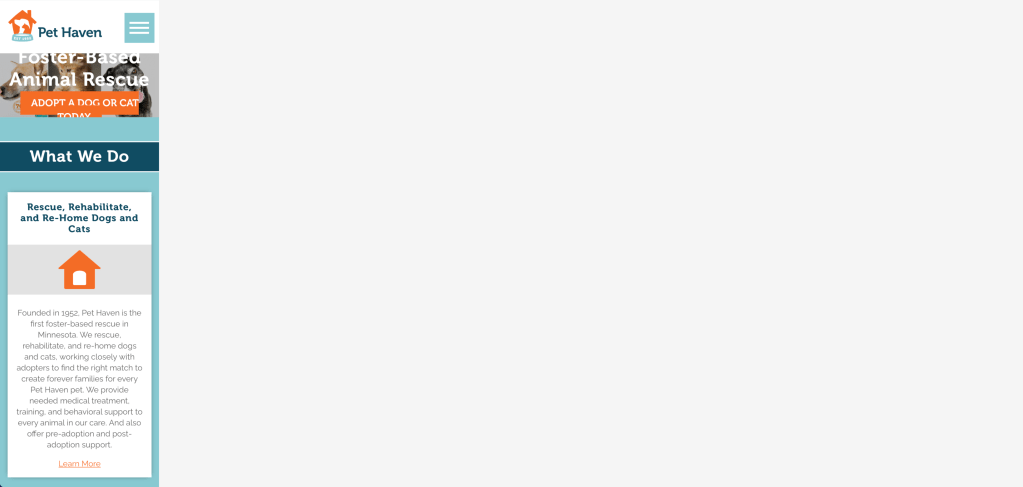
Pet Haven
Not a mobile-friendly site. This is a fairly good example of the other sites I came across. They’re a local shelter that has their own site just for their region.
Direction
At this point I’m thinking that the product shouldn’t focus on browsing long lists of dogs. Instead, it should focus on the intended goal of matching a person with a dog. I think I’ll lean into having a questionnaire to find the user’s pet preferences as the primary experience, with browsing as an optional/secondary experience. This reminds me of ZipRecruiter, where they have an AI consearge to find jobs for you. I think I’ll look there for inspiration and then dive in.
There’s a few reseasons I’d like to focus on the questionare experience:
- The market is already fairly saturated with browsing-first products.
- I find that when dealing with a large data-set with lots of variables (some of the most important being emotional), browsing tends to become either ineffective for finding the “best” option or requires skill and awareness of how to sort through the data.
- Focusing on the questionnaire allows the service to match a person to a dog based on the needs and ability of the person, not just the breed/age/size/etc… of the dog.
- Receiving clear recomendations can ease the decision-making process. I think especially in this scenario where the potential pet owner usually has to bounce back and forth between rational/logical decision making and experiencing an emotional connection/reaction with their potential pet. It can be exhausting, and the confused mind says “no”. If the user can have confidence that the service will only provide recommendations that are realistic/logical, then they can let go of that burden and focus exclusively on gauging their emotional connection to the recommendations.
- Setting the expectation for receiving recommendations allows interaction with the platform to comfortably go on longer. The user expects to recieve ongoing recommendations, so they’re not suprised if they don’t find their pet in their first interaction with the platform. If they did find their pet in the first interaction, it would be considered a big win. However, in a browsing scenario, it is expected that the user should be able to browse through the options and find what they want in a single session. If they do not find what they want, they’ll have to come back another time to see if availability has changed. At that point, even a notification feels like a backup plan for the initial failure of the platform.
Outline
Sometimes I use a giant sharpie to write on this giant pad of paper, because leaving a digital format and computer-using posture makes me think differently. It also makes me a slightly happier person and gives me confidence that I didn’t miss something while staring at my computer screen.
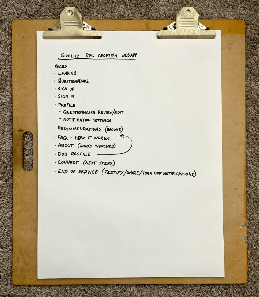
Walkthrough
The ideal user experience goes like this:
- The user navigates to the landing page on their phone and sees the marketing material depicting the user’s end goal, why they should trust the site, and articulates the problem they (and the dogs) face. If the user hasn’t already clicked on the call-to-action button to get started, they can scroll down to see how the process works.
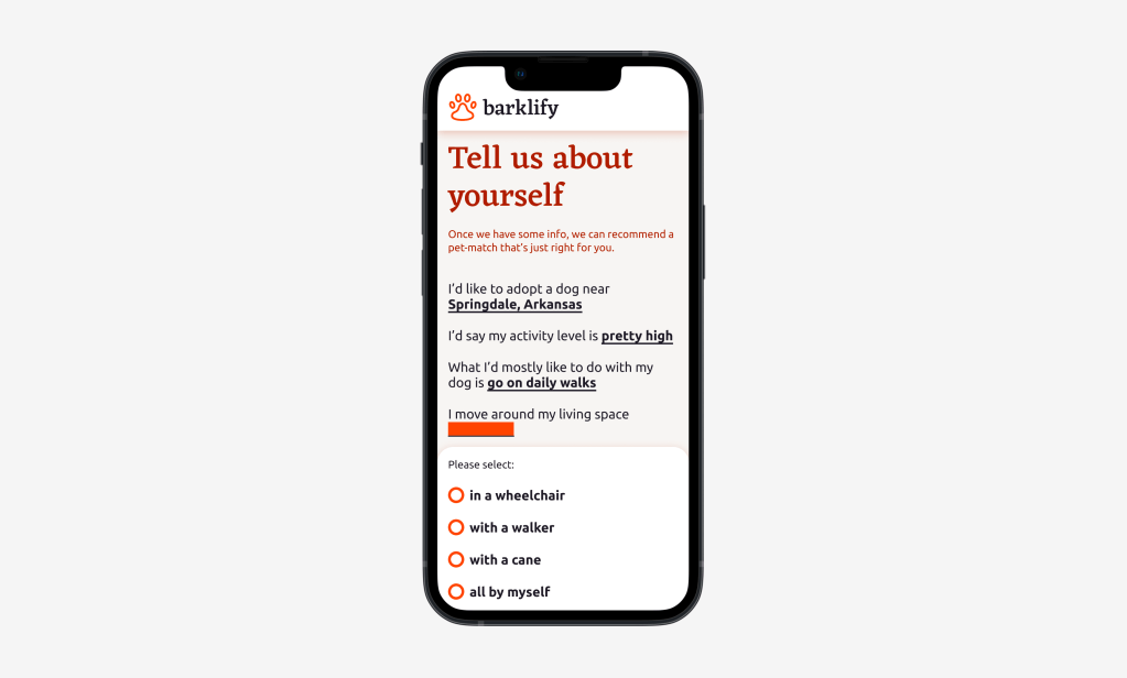
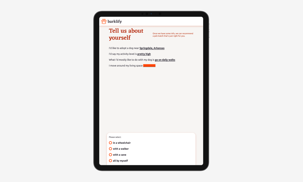
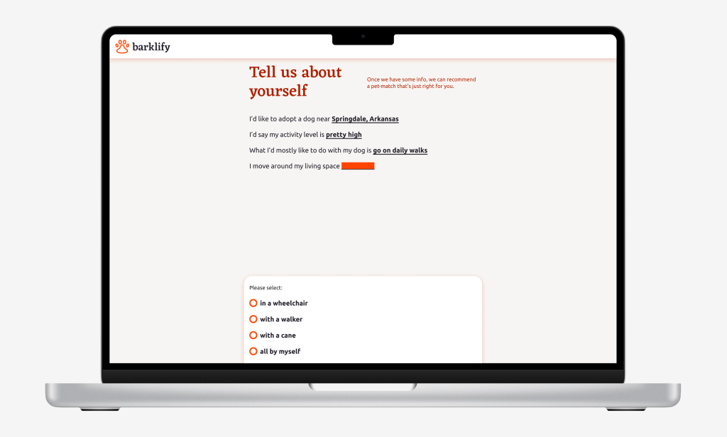
- Once they click on the call-to-action button, they’re immediately taken to a questionnaire to fill in info about their lifestyle and ideal dog. This info will be used to give the user recommendations of dogs to adopt.
- When they finish the questionnaire, they will be asked to create an account, ideally through a third-party login like Google.
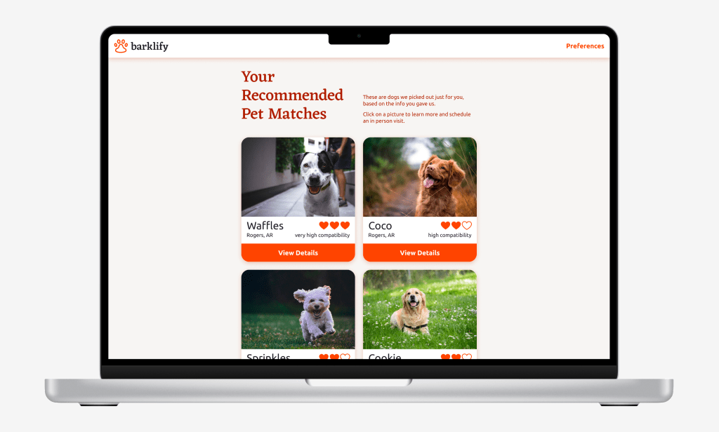
- The user is taken to the recommendations page, which shows them dogs in their area that would be ideal for the user to adopt.
- If the user does not immediately find a dog they like in the short list of recommendations, they will receive notifications according to the preferences they defined in the questionnaire. The notifications will highlight a specific ideal dog for the user to adopt.
- The user is taken to a specific dog’s page, either from the recommendations page or directly from a notification. This page includes information that is tailored to the user about why this dog was recommended to this user.
- The user schedules a visit to meet the dog in person. Information is sent to the dog shelter to notify them of the visit.
- If the user did not adopt the dog at the visit, they will receive an email or text the day after the scheduled visit asking for feedback.
- If the user did adopt the dog, they will receive a text or email congratulating them on their new connection. If they click on the link, they will be taken to a page where they can write a testimonial, share on social media, and turn off future notifications.
Wireframes
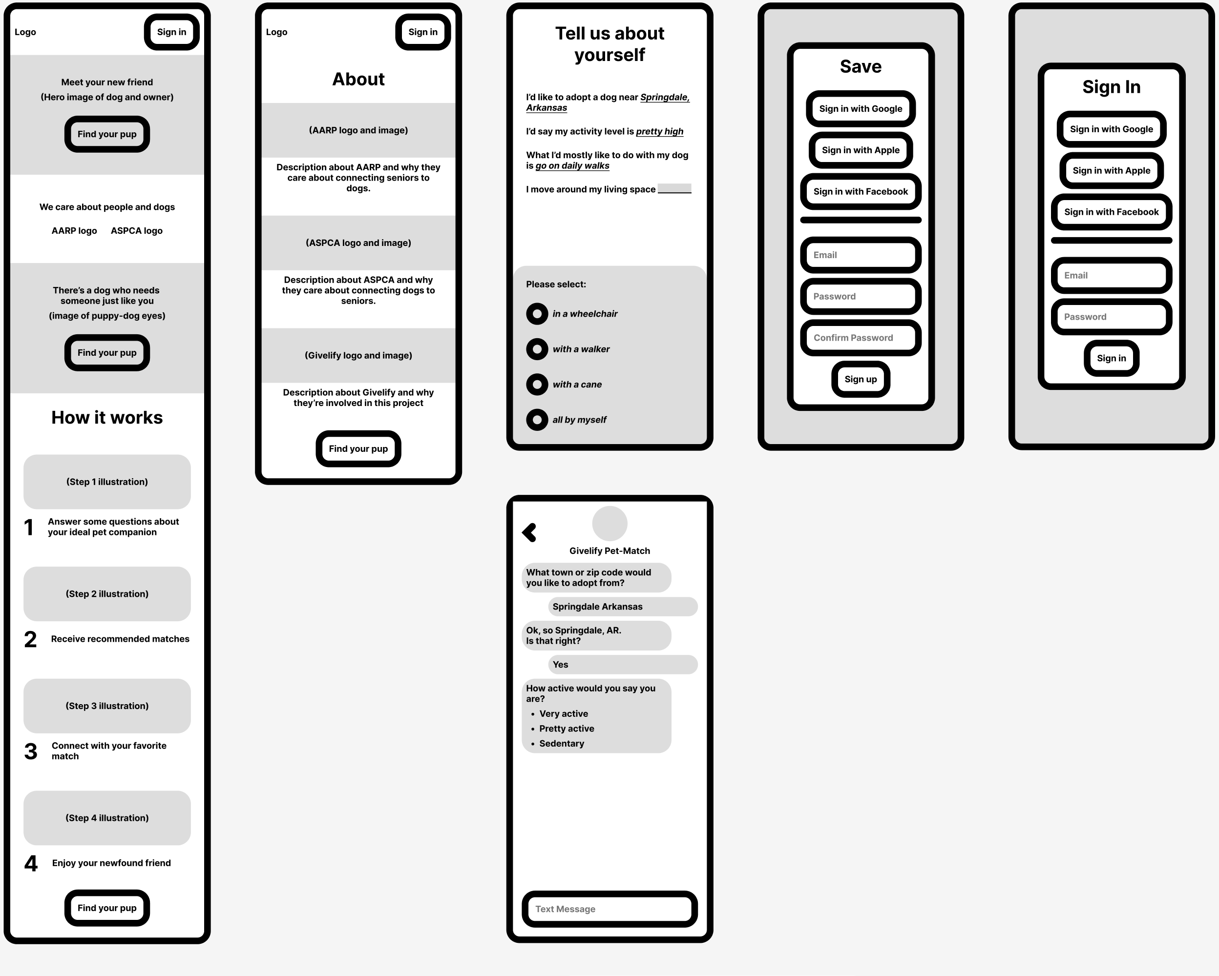
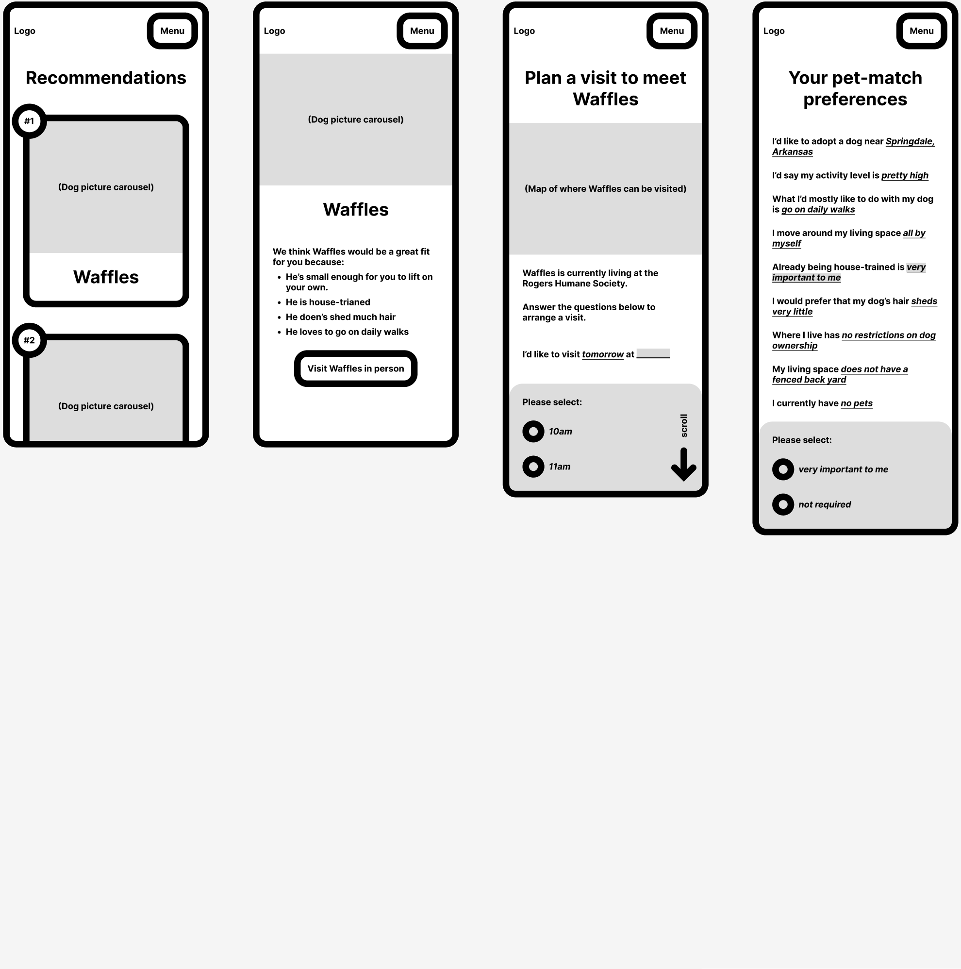
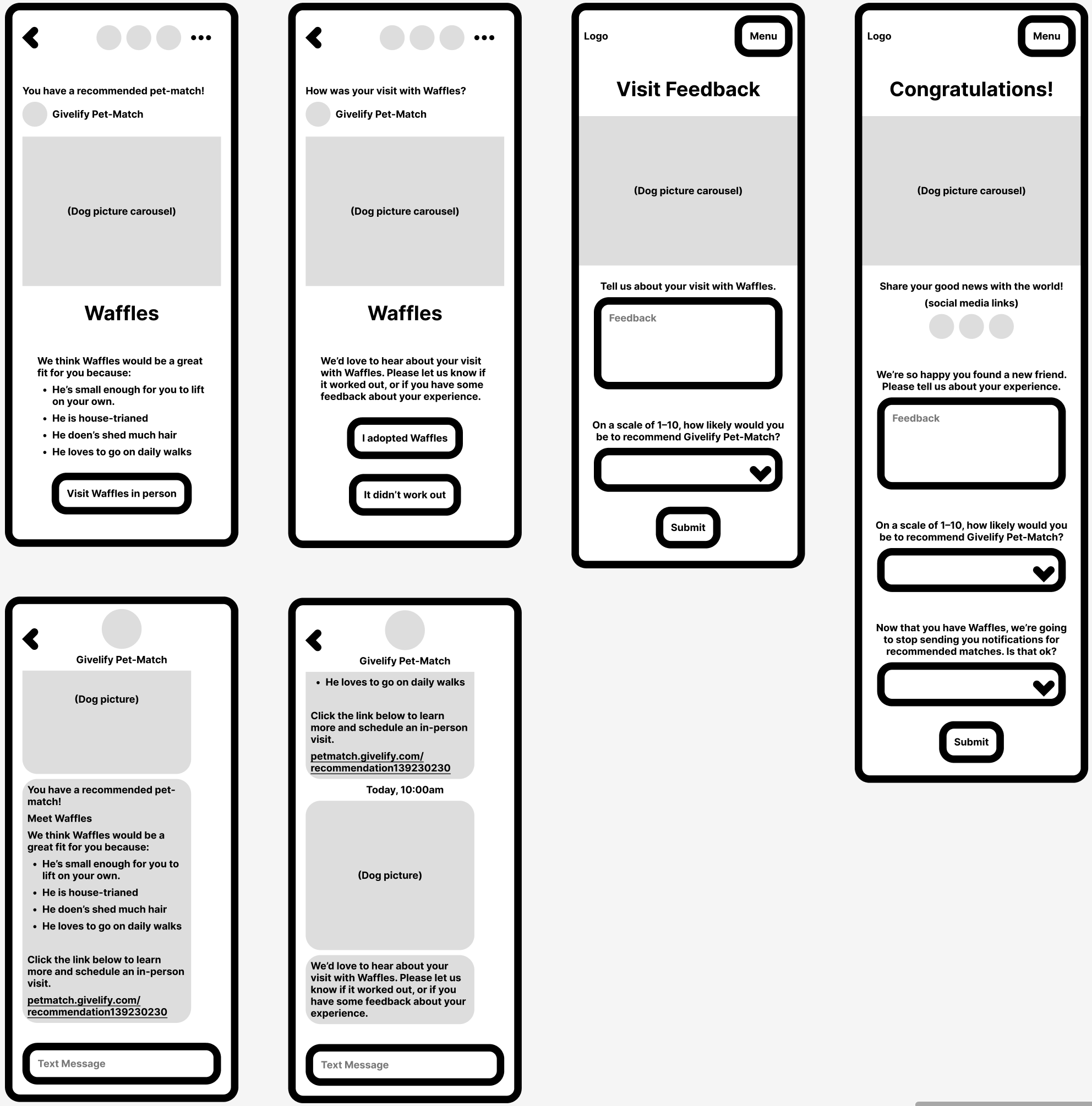
There’s several ways to do wireframes, and the biggest decision to make is often the level of fidelity the wireframe should represent. In this case, I’ve decided to use a chunky UI style limmited to black and white with some gray. I’ve chosen to type out actual words to help display the content of the pages, but I haven’t bothered to write out everything on each page, just the main things. This level of fidelity helps me to think about the content of each page without worrying too much about UI elements. This is probably on the higher-fidelity end of the wireframe spectrum, but since I don’t know exactly who I’m handing this off to or if I’ll be able to have a conversation with them it’s better to err on the side of overcommunication.
I’ve made the header a component with variants, since they’re used on almost every page. But everything else is one-of-a-kind. I like to use components as much as possible in high-fidelity mockups (for my own benefit as well as the developer’s) but I try to stay away from components in wireframes to allow more freedom to express the needs of the product.
High Fidelity Mockups
I chose to design out the questionnaire and recommendations pages for the HiFis, since those are two of the most important pages for the experience and they show some UI variety.


Thanks
Thanks for reading. Hopfully this gives you a better idea of how I go about thinking through a product design product.
