Texas Medical Board
UX Research | UI Component Design | CMS Redesign
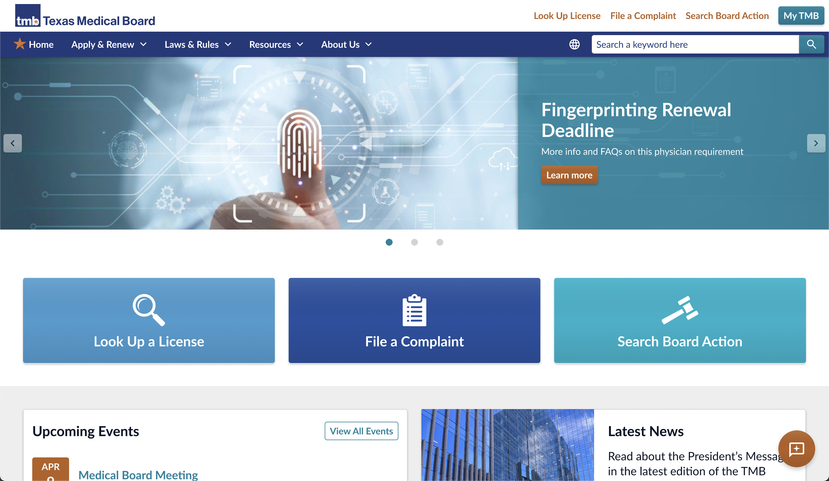
The Texas Medical Board (TMB) is a governement organization that oversees licensing healthcare practitioners and informs the public about medical regulations in the state of Texas.There are nearly a dozen types medical licenses in the state, each with unique requirements for license application, renewal, and continuing education.
Not only do healthcare practitioners need to find and understand the steps to be taken relevant to their individual circumstances, the general public also needs to be able to look up licenses, file complants, and be made aware of any changes to medical regulations.
TMB hired my team at Spruce Technology to redesign their website and untangle the various user journeys accross the site.
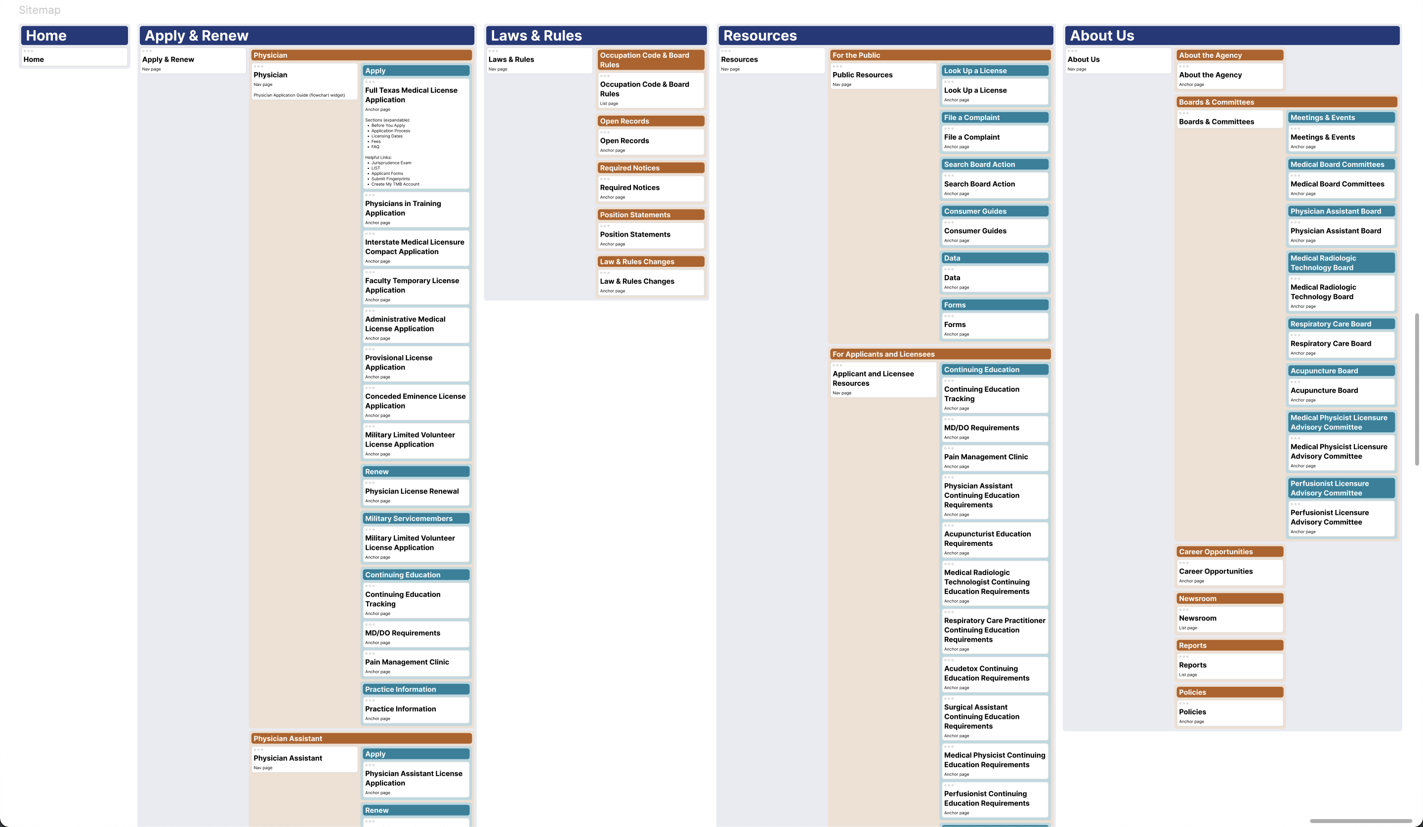
My first step, as UI/UX designer on this project, was to interview TMB stakeholders to understand the current organization of the site, identify user personas, and reorganize the sitemap to align with persona user journeys.
When you have piles of important, interelated, technical information on a site, it's easy to fall into the trap of placing all related info on one page or inadvertantly distributing content relevant to one person accross the entire site.
My core goal was to ensure that each user felt confident that they were viewing all the content relevant to their needs without stumbling over content that wasn't relevant to their situation.
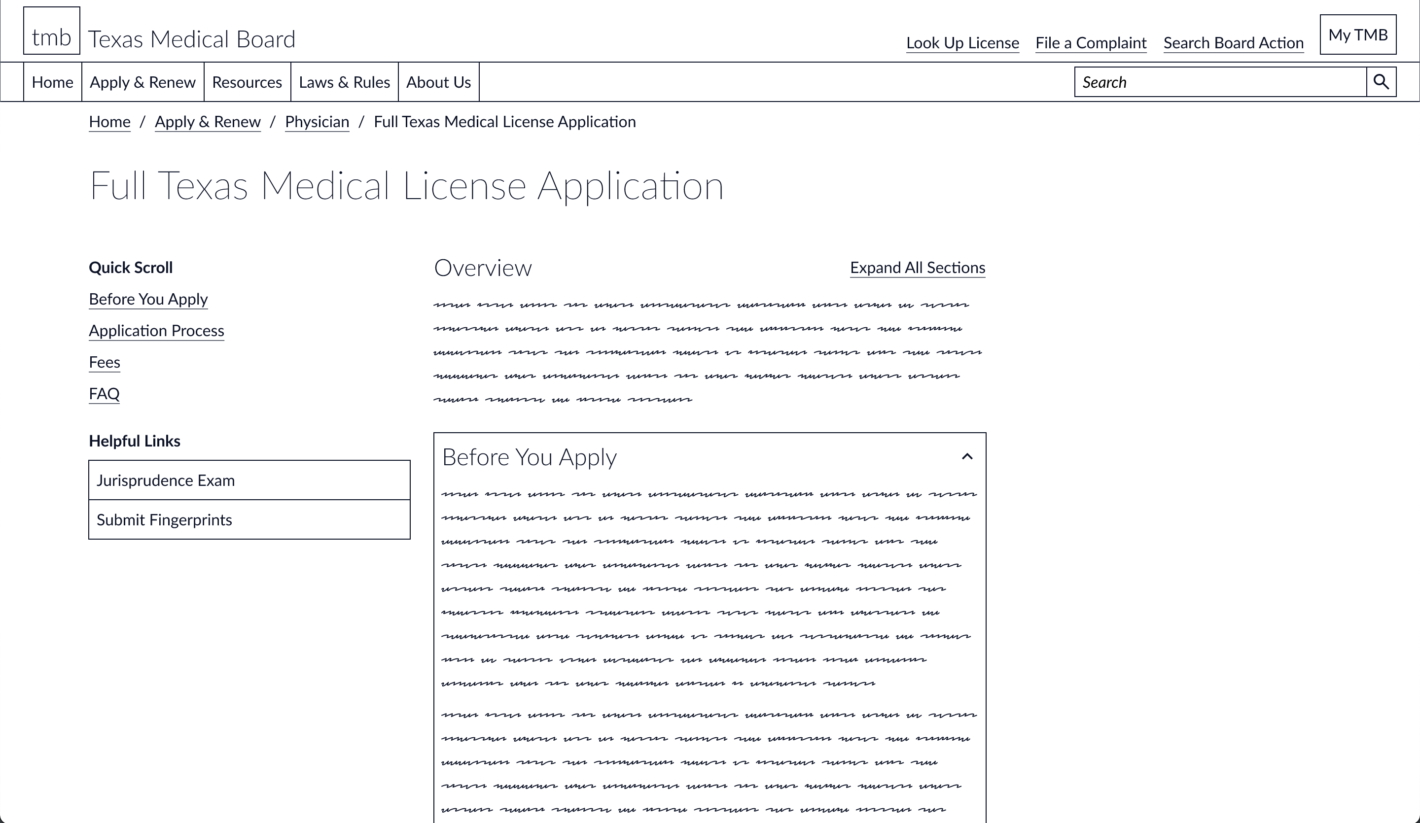
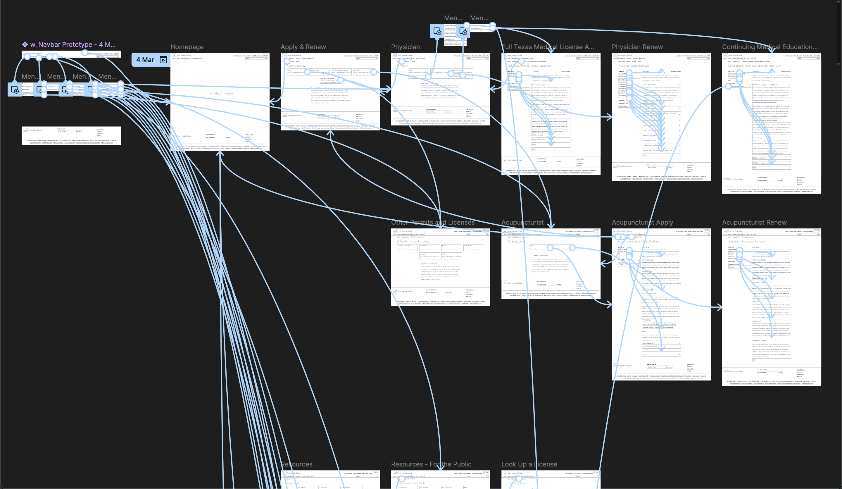
Once we agreed on the new sitemap, I created an interactive wireframe prototype to allow the client (and my team) experience navigating the new content structure without worrying about UI styling.
Taking the time to do wireframes before diving into high-fidelity mockups ensures that the core information architecture and UX problems are solved. For some projects and clients, judging the effectiveness of a new sitemap and a UI component refresh at the same time is too overwhelming to be done effectively.
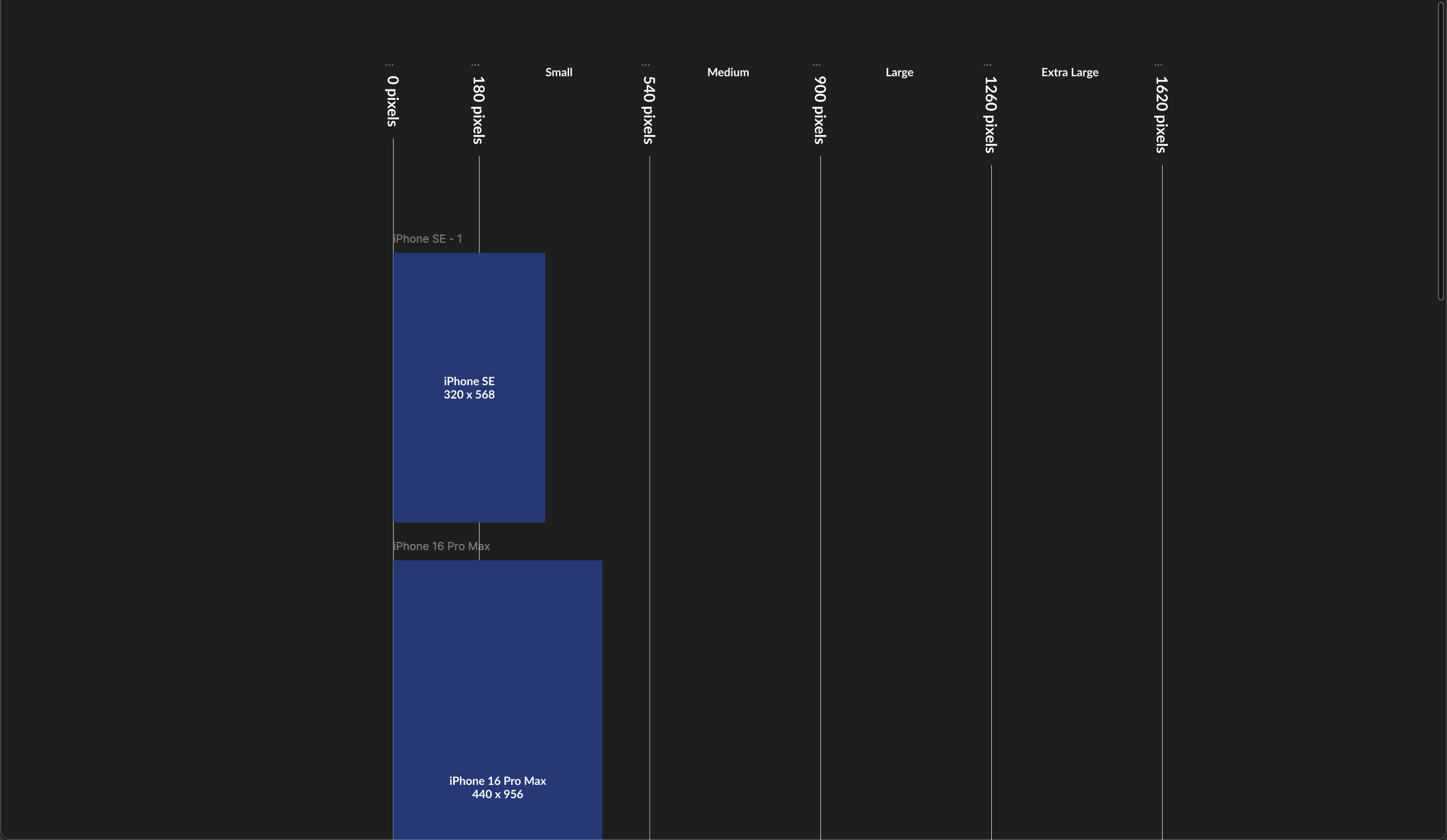
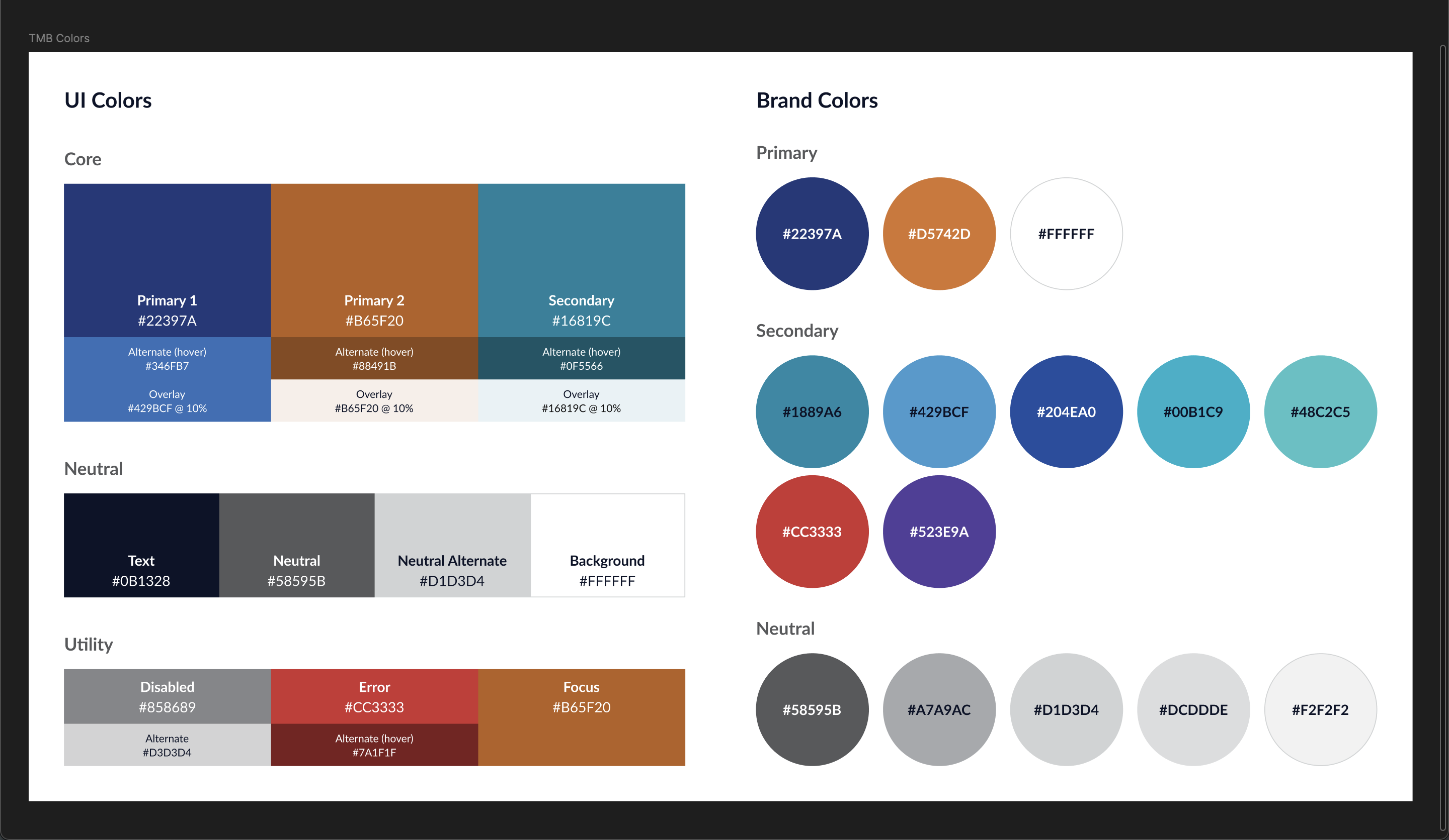
With the major UX problems solved, I dove into the styleguide and started setting up a system for handle UI responsiveness consistantly accross all components.
Defining responsive breakpoints early on in a project can save a lot of headaches for designers and developers later on. As new devices are introduced into the market, ideal breakpoints shift to accomodate wider or narrower standard screen sizes.
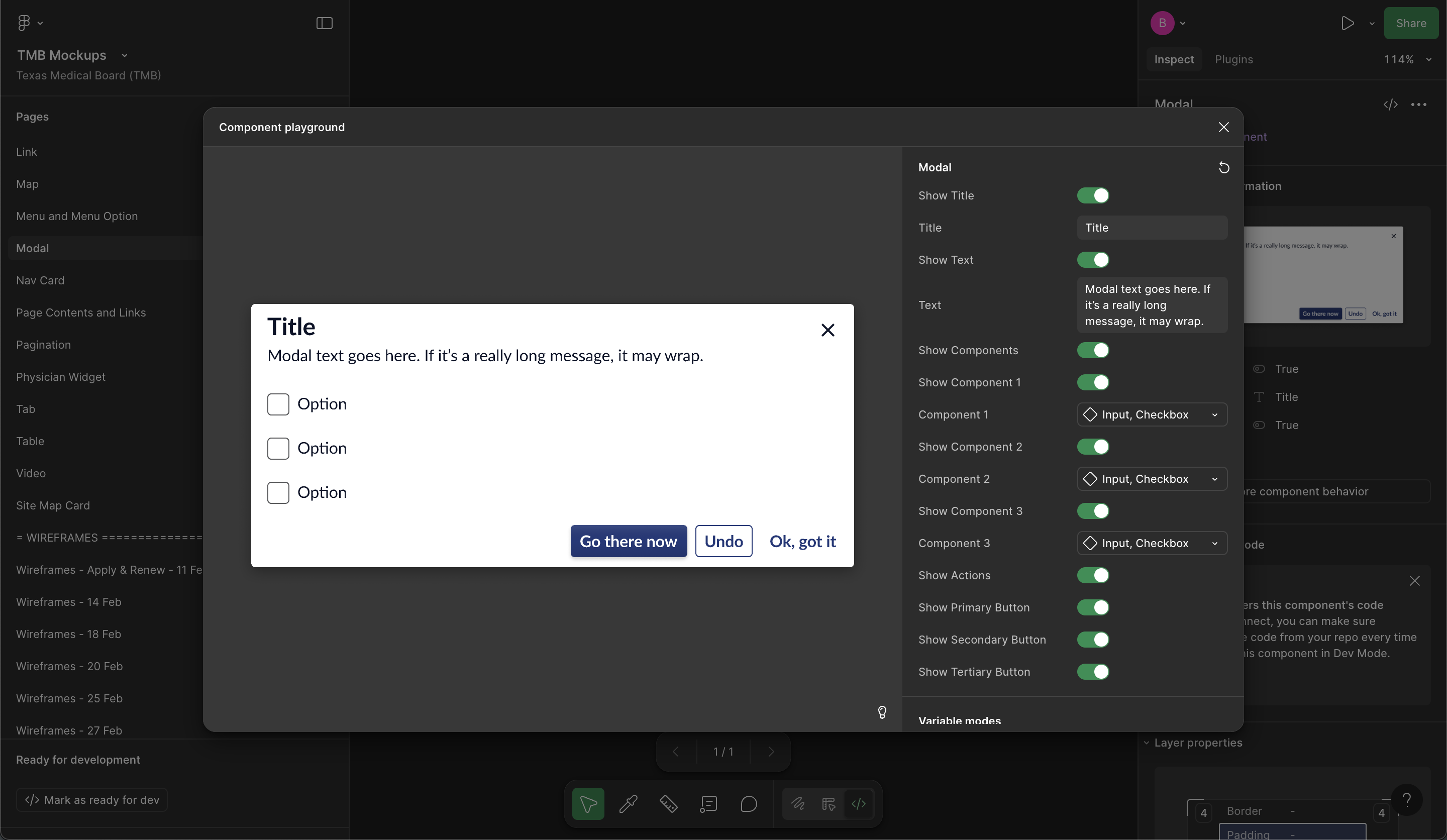
I design each of my UI components to be accessible, responsive, and interactive from the beginning. This process keeps me focused on how developers will actually be implementing the UI so that things turn out exactly as I envision them in production.
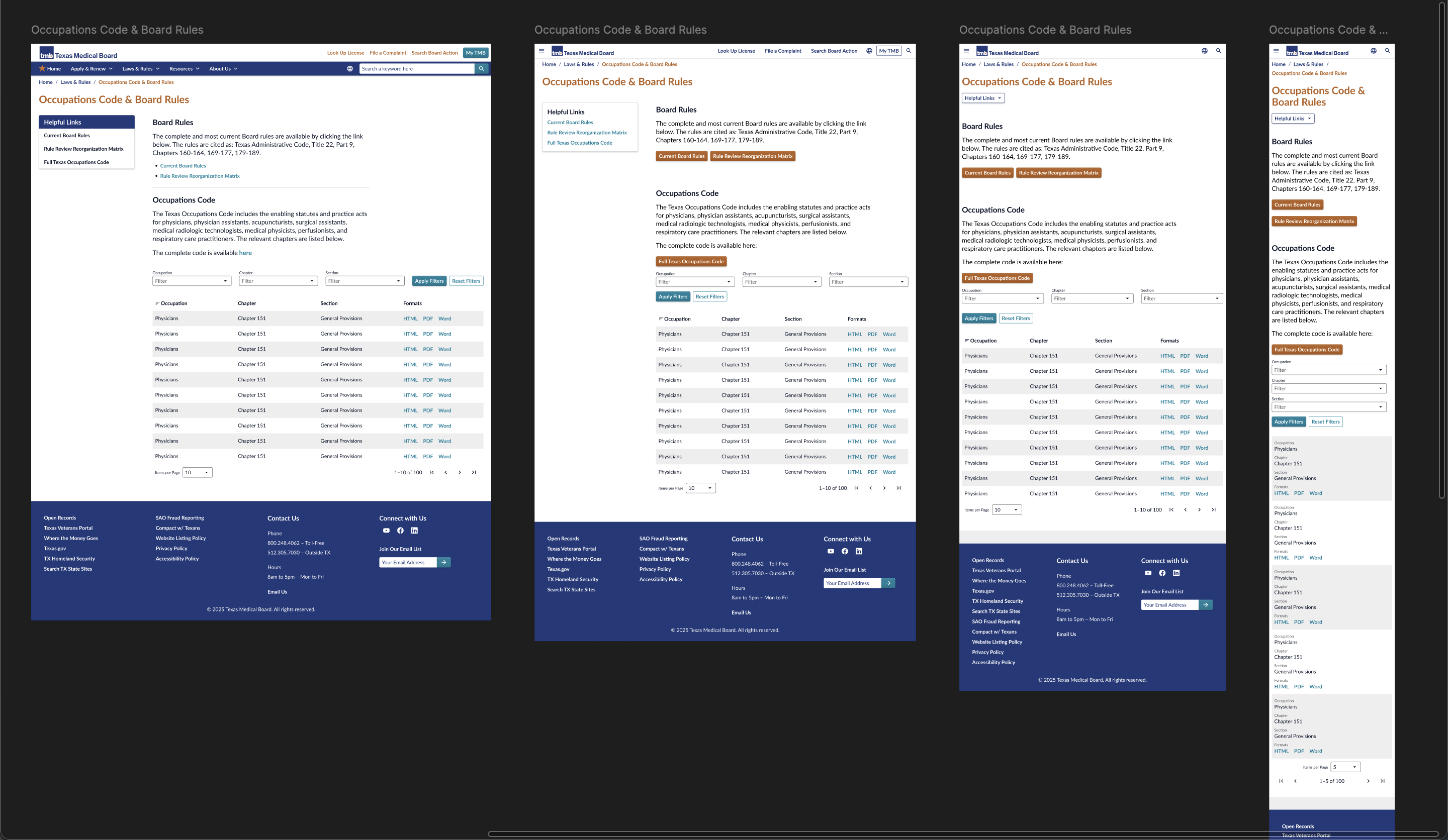
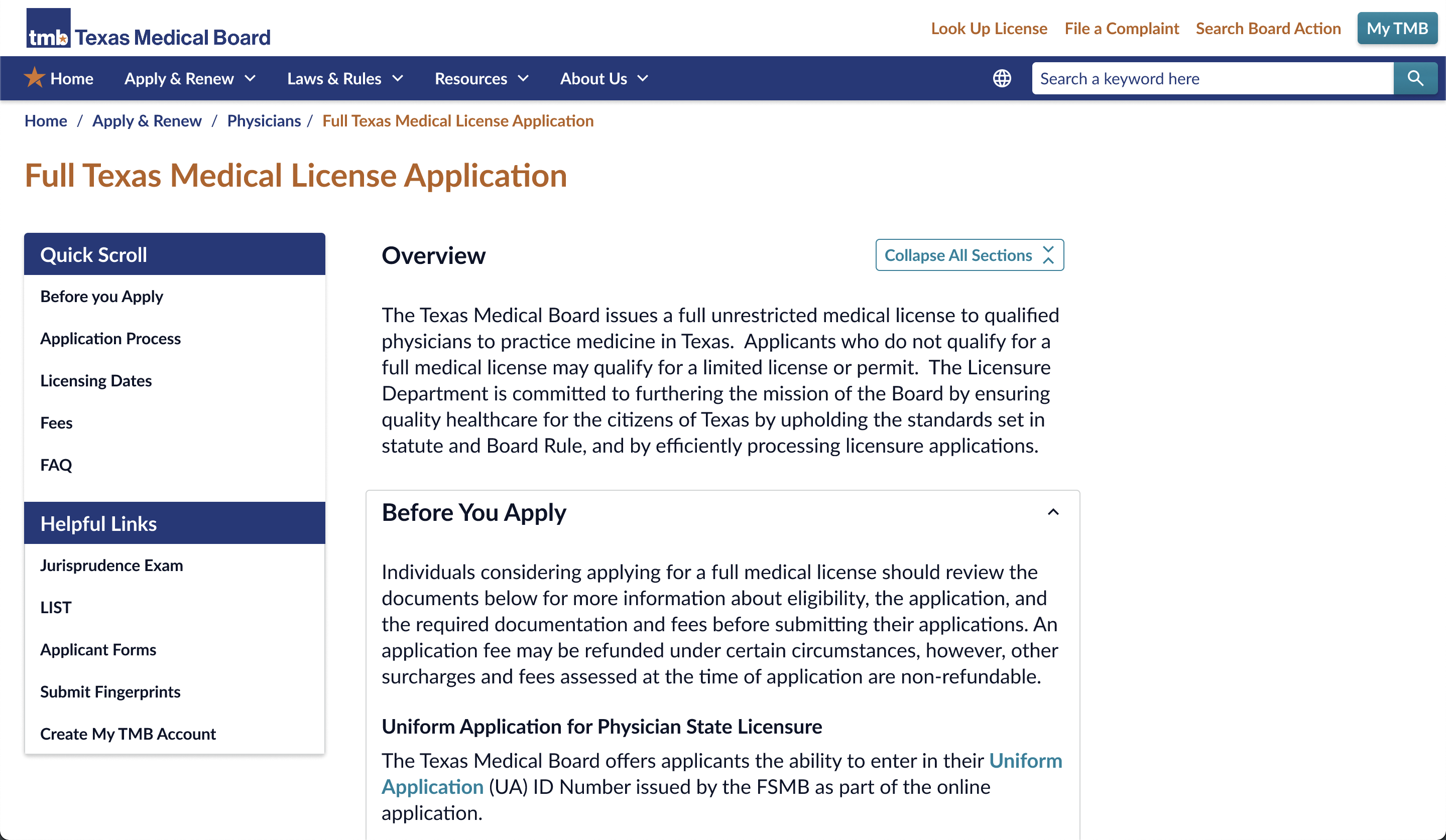
My next step is to start building page templates composed of my high-fidelity, interactive UI components and based around the needs of the content in the sitemap. I like to represent an example of each page template across all supported screen size categories to better present to clients and hand off to developers.
At that point of the project, its easy to create a high-fidelity, interactive prototype for the client to explore and provide aditional feedback that they would not otherwise have been able to predict before development.
This project featured a step-by-step "wizard" questionare to guide healthcare practitioners to the information and actions most relevant to their situation. It also included an AI driven chatbot that could field user's questions and direct them to pages within the site for the answers.
Overall, user jouneys on the site became simpler and more easy to navigate, while TMB staff recieved fewer emails and phonecalls asking for information that could now be easily found on the website.
Let’s chat about your next product design challenge.
Based in Arkansas — Fully remote