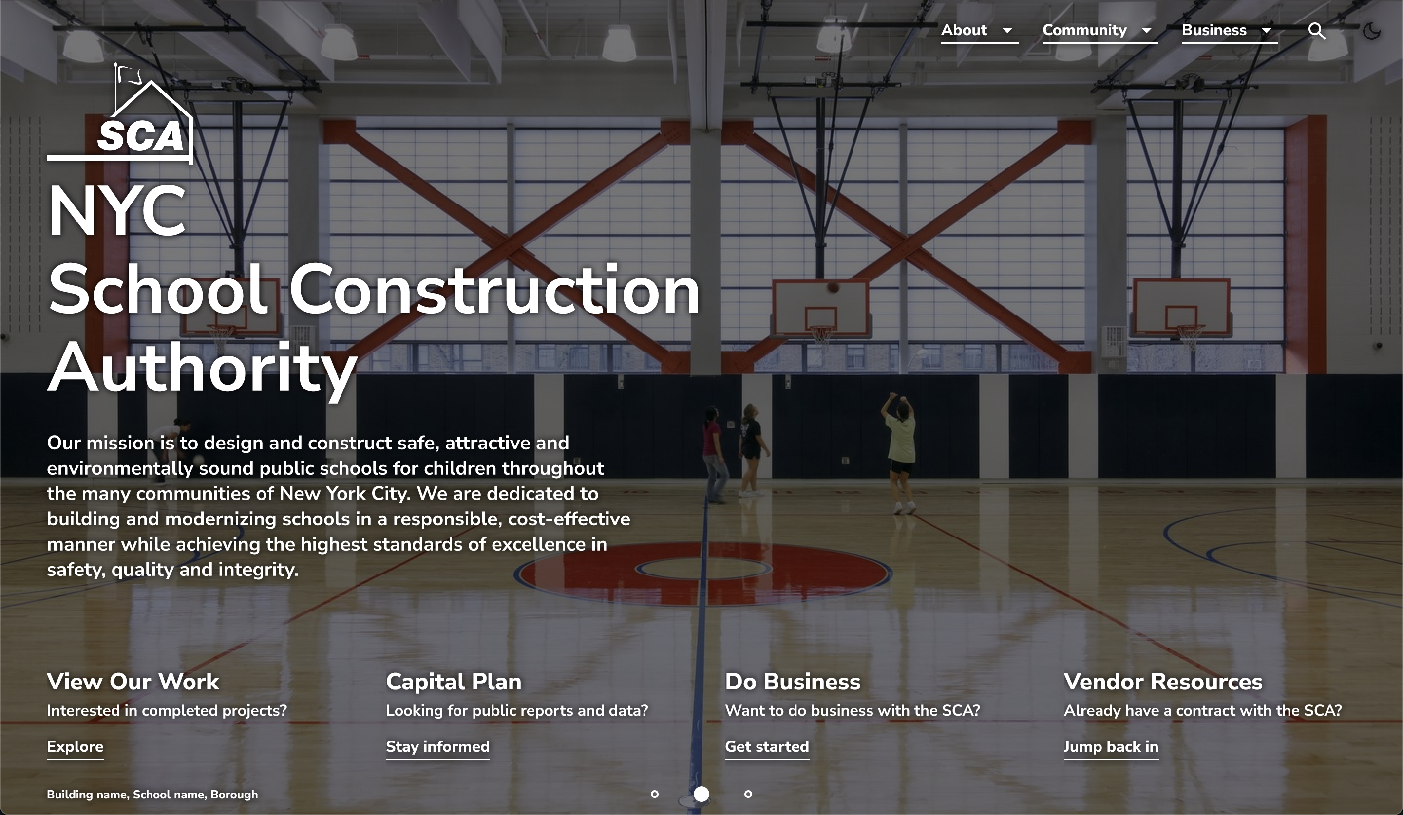
NYC School Construction Authority
UX Research | User Journeys | CMS Redesign
The New York City School Construction Authority needed to switch to a new content management system, reorganize their website to better accomodate a diverse array of visitors, and upgrade to a fully accessable and responsive UI.
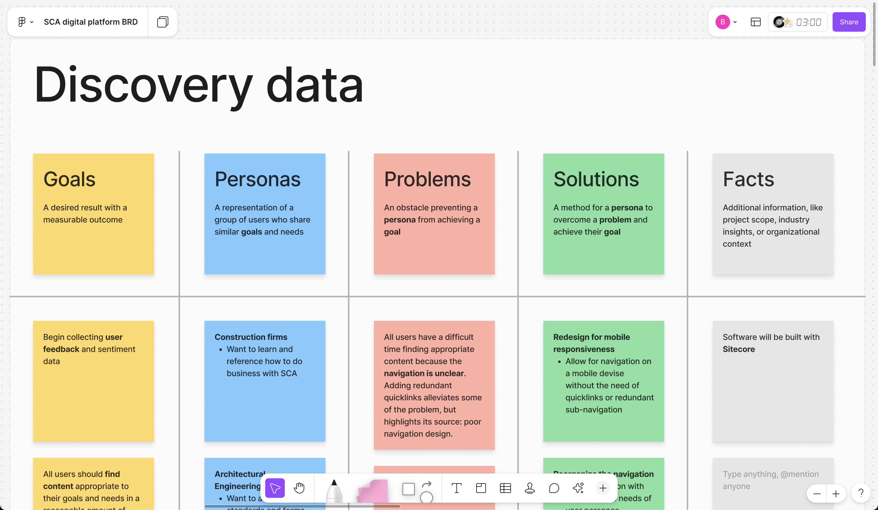
My project manager, James Seal, and I interviewed every department within the SCA to understand how their users needed to access certain content on the site. We developed a discovery framework to uncover user personas, their goals, problems impeding their goals, and insights or proposed solutions from subject matter experts.
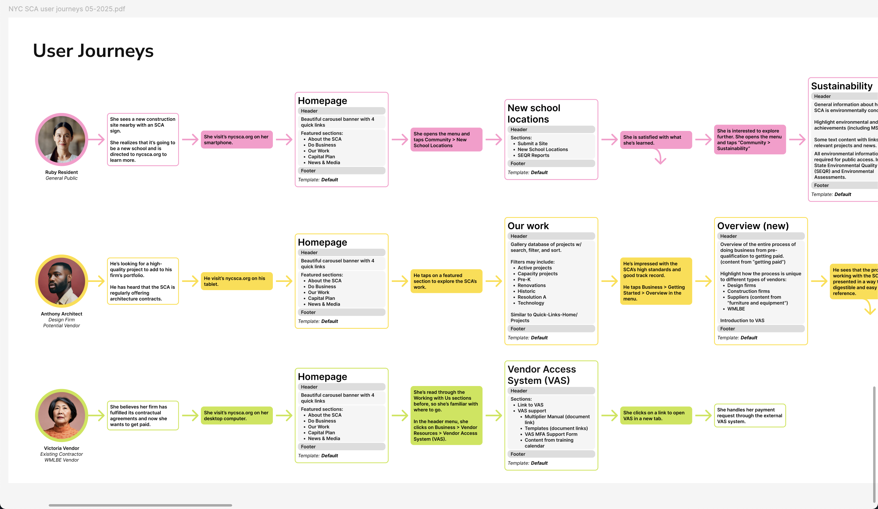
I converted that data into an array of user personas, each of which represent a unique set of goals to be accomplished on and off the website. Then I mapped out the ideal experience for each persona in acheiving their goals with the help of the new site.
It's important to remember that visitors to the website aren't initially interested in the various departments of the organization and "use a website" is not on their to-do list for the day. Keeping in mind how each persona may navigate to and away from the digital product while pursing their individual goals is paramount to crafting an excellent digital experience.
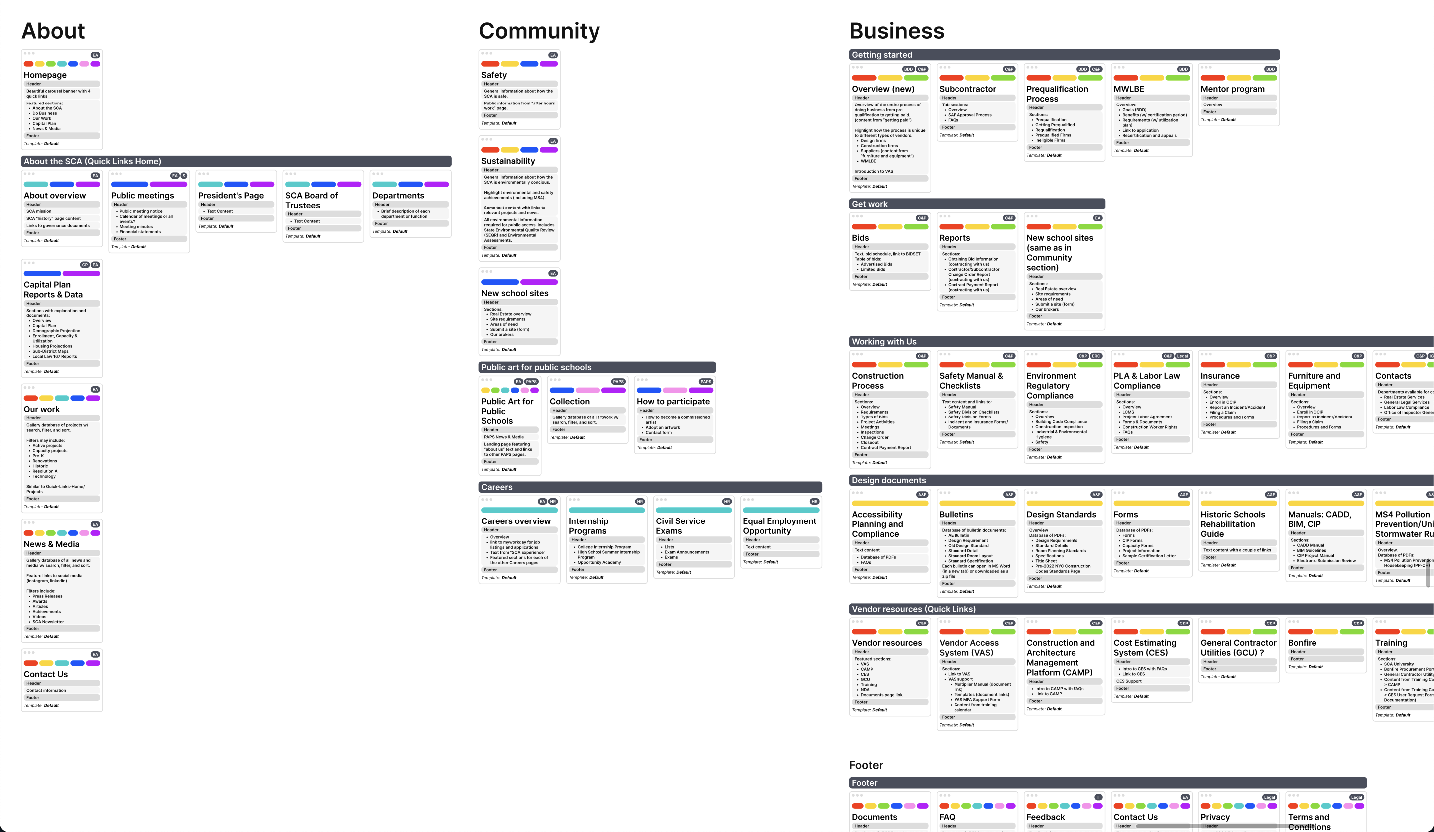
I recreated the website's previous structure by assembling a card for each page with its title, summary of content, and interested personas. Then I rearranged the sitemap to model the ideal user jouneys I'd mapped out previously.
One of the revelations of this process was that the site actually had two primary types of content with associated personas: general information for the community, and technical information for current and potential business partners. Understanding the relationship between the content and the users allowed me to organize the site so that each persona could access content relevant to them without stumbling over pages they have no interest in.
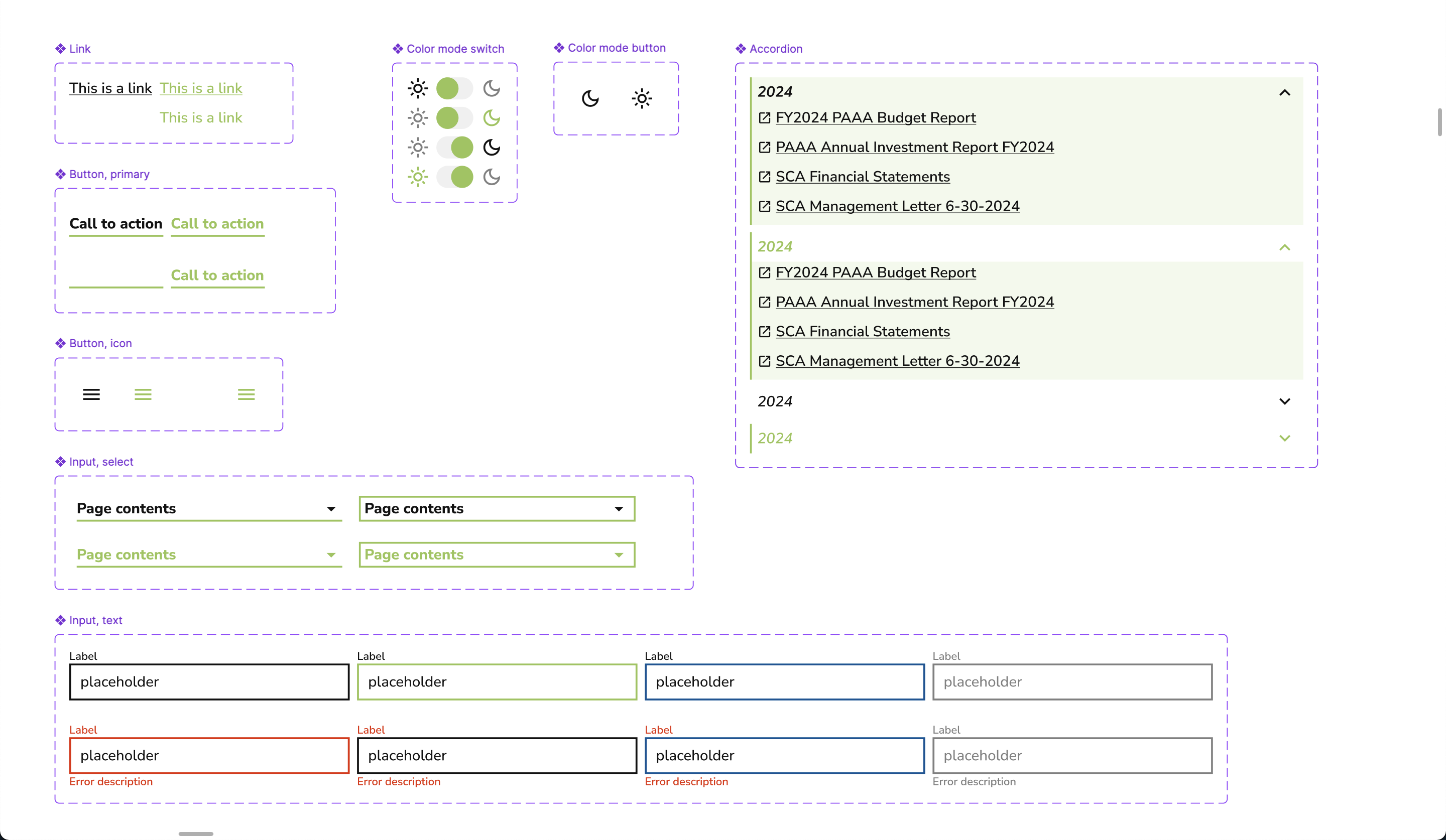
As I was conducting stakeholder interviews, I was also builing a component-based UI system in Figma condusive to the organization's brand. These components are designed with accessibility requirements, responsivenes, and interaction states build right in.
I add prototype interactions, like hover states, into the components as I design them so that when they show up on a page within a client-facing prototype, every component already behaves as expected.
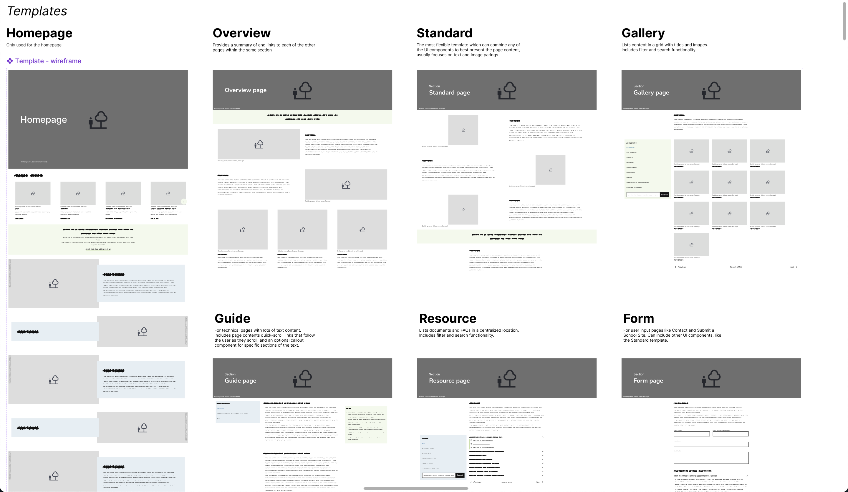
The next step was to identify which templates would be needed to best display the content on the site.
Templates designed for the general public side of the site utilize short blocks of text with lots of images for maximum browsing convenience.
Templates designed for the technical business side of the site make use of quick-scroll anchor links to present dense paragraphs of copy in consumable, referencable chunks.
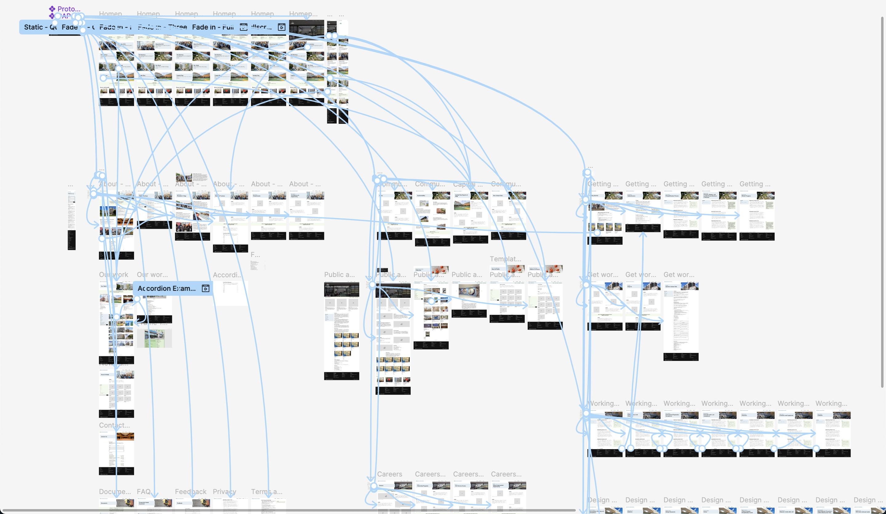
Once we had UI components and templates formalized, I put together a fully linked prototype to allow stakeholders to navigate to every page of the new site within Figma. Many of the pages still reflected a low-fidelity template with filler text, while key pages featured high-fidelity fully-rendered content.
This facilitated important internal discussions for our client so that each department would be comfortable with where their content lives on the site.
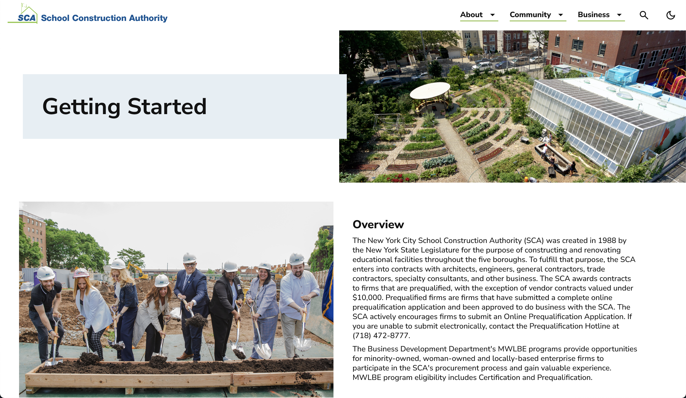
In the end, this redesign did not get pushed to production, due to internal leadership changes on the client's side. However, the insights we uncovered through diligent stakeholder interviews, user journey mapping, iterating through potential sitemaps, and organizing the website based on user persona goals illustrated clear improvements for the site in the future.
Let’s chat about your next product design challenge.
Based in Arkansas — Fully remote